Python And Matplotlib
Using population data from Statistics Sweden (with the much cooler swedish name Statistiska centralbyrån or Statistical Central Bureau) at [1] I want to make some plots - here using python and matplotlib.
Short introduction to matplotlib
Matplotlib is a free software/open source plotting library for the python and numpy environment. It was written by a man named John Hunter that died of cancer in late August 2012.
It was originally written to replicate mathworks matlab (see [2]).
Read more at:
- An 3 hour 19 minute introduction held by Eric Jones at a python conference 2012 [3]
- matplotlib.org: [4]
- Wikipedia: - [5]
Installing
I tried installing it on in cygwin on a windows machine but it seems to be complicated. Perhaps it is easier with a more common windows-python. It was just easier for me to install it in my virtual ubuntu machine.
$ sudo apt-get install python-pip
[...]

$ sudo apt-get install python-numpy
[...]

$ sudo apt-get install python-matplotlib
[...]
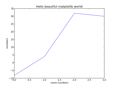
And to try it works let's do a really simple plot
import matplotlib.pyplot as plt

plt.plot([-8, 4, 32, 30])
plt.ylabel('numbers')
plt.xlabel('more numbers')
plt.title('Hello beautiful matplotlib world!')

plt.savefig('numbers.png')
By default matplotlib makes these images 800x600 pixels - I have scaled them down by 50% to save precious screen space. Except for the last image in this little tutorial.
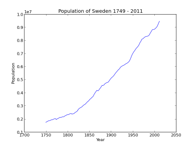
Using the data from the Statistical Central Bureau
The page on Population and Population Changes 1749-2011 in Sweden at scb.se has an attached xls-file - see the bottom at [6]. I hacked away the headers and removed the annoying commas and points and saved the file as a tab separated text file with just the data. The columns are Year, Population, Live Births, Deaths, Immigrants, Emigrants, Marriages and Divorces. This is a little ugly and hard coded but what I want to show here is matplotlib. The raw data now look something like this:
1749    1764724 59483   49516   0       0       15046   0
1750    1780678 64511   47622   0       0       16374   0
1751    1802132 69291   46902   0       0       16599   0
...
2009    9340682 111801  90080   102280  39240   48033   22211
2010    9415570 115641  90487   98801   48853   50730   23593
2011    9482855 111770  89938   96467   51179   47564   23388
Let's first plot just the population over time to get a quick look at the data and how I import it:
import matplotlib.pyplot as plt

def read_my_file(filename = "be0101tab9utveng.txt"):
    """Read the file and return a dict of a list of integers. Such that f.x:
    data['Year'] = [1749, 1750, 1751, 1752, 1753, 1754, ... 2010, 2011]
    """

    # this is a little hardcoded
    headers = ['Year', 'Population', 'Live Births', 'Deaths', 'Immigrants',
               'Emigrants', 'Marriages', 'Divorces']
    data = dict()

    for header in headers:
        data[header] = list()

    f = open(filename, 'r')
    for line in f:
        values = line.split('\t')
        for i in xrange(len(values)):
            data[headers[i]].append(int(values[i]))

    f.close()
    return data

data = read_my_file()

plt.plot(data['Year'], data['Population'])
plt.ylabel('Population')
plt.xlabel('Year')
plt.title('Population of Sweden %s - %s' % (data['Year'][0], data['Year'][-1]))

plt.savefig('matplotlib-swedenpop.png')
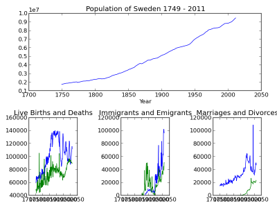
Add some subplots
There are a couple of ways of adding subplots with matplotlib - in this example I want one major plot on top with the population and then three smaller ones below for nativity, migration and mariage/divorce.
In short we do just a few more steps:
- Add a call to subplot2grid to define the layout of the subplots. In the call we mention how many rows and columns we want, what position the next plot will have and if it will span any of the rows or columns.
- Some methods, like set_title, get new names.
- Add a call to plt.tight_layout() to improve the layout.
# ...

# first subplot will consume three spaces
ax = plt.subplot2grid((2, 3), (0, 0), colspan=3)
ax.plot(data['Year'], data['Population'])
ax.set_xlabel('Year')
ax.set_title('Population of Sweden %s - %s'
             % (data['Year'][0], data['Year'][-1]))

#second subplot consumes one space
ax = plt.subplot2grid((2, 3), (1, 0))
ax.plot(data['Year'], data['Live Births'])
ax.plot(data['Year'], data['Deaths'])
ax.set_title('Live Births and Deaths')

# ...

plt.tight_layout()

# ...
The result is something like this:
Tweaks
The first thing that has annoyed me is the range of years - there is a lot of empty positions in the beginning and end: ax.set_xlim(data['Year'][0], data['Year'][-1]). There is of course a similar method for the y-axis limits - but they are ok I think.
Also there is too much text displaying the years - they don't fit. We need to do something about that.
from matplotlib.artist import setp
from matplotlib.ticker import FuncFormatter

# ...

# this could be also be a date formatter for example
def million_formatter(value, position):
    """I want f.x. 1500000 to be represented as 1.5"""
    return "%1.1f" % (int(value) * 1e-6)

formatter = FuncFormatter(million_formatter)

# ...

ax.yaxis.set_major_formatter(formatter)

# ...

labels = ax.get_xticklabels()
setp(labels, rotation=60, fontsize=8)
labels = ax.get_yticklabels()
setp(labels, fontsize=8)

# ...
Let's take a look at the finished result:
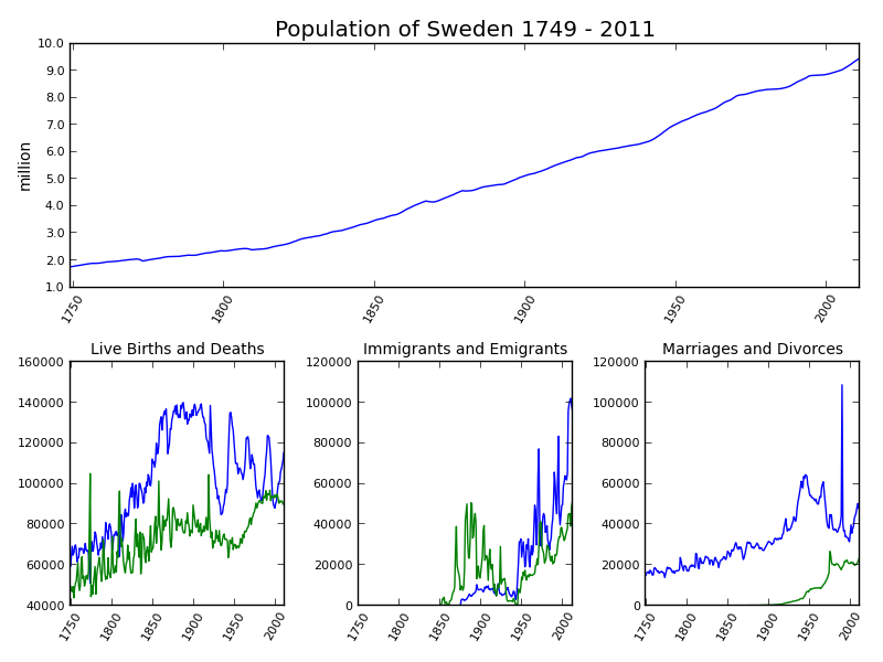
Now that we can look at it without hurting our eyes we can make an analysis:
- We are soon 10 million people in Sweden.
- Around 1990 we have a peak in marriages. It turns out that this was related to changes in the law regulating widow's pension (see Swedish Wikipedia: [7]) that took affect on January 1st 1990 and in 1989 we had more than one twice the marriages we had the years before and after.
- After the second world war there has been a change from mostly emigration to mostly immigration.
- Since the depression we can identify clear baby boom generations and it seems we are entering one now :-)
This page belongs in Kategori Plot
This page belongs in Kategori Programmering
See also Plotting With Gnuplot
See also Plotting Matplotlib Stock History
See also Plotting Matplotlib Console Wars