Plotting Matplotlib Console Wars
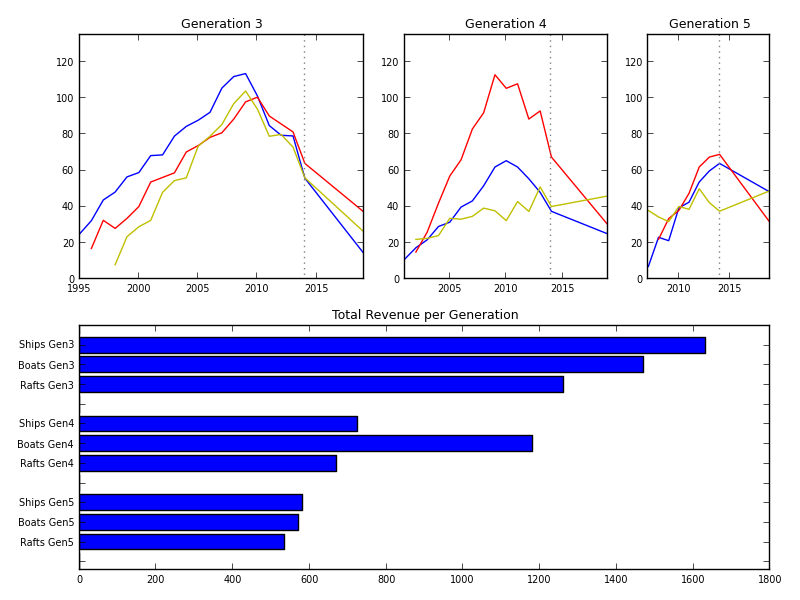
I got inspired by a plot from the economist: see [1]
I made a clone with matplotlib:
import matplotlib.pyplot as plt
from random import randint, choice

def get_y(xvalues, gen):
    yin  = choice([0]*randint(10,40) + range(25))
    ytop = randint(45, 145) - gen*15
    if gen == 1:
        ytop = randint(80, 125)
    yend = randint(3, 30) + 10 * (gen - 1)
    xtop = choice(xvalues[len(xvalues)/3:2*len(xvalues)/3])

    yvalues = list()
    k1 = (ytop-yin)/float(xtop-xvalues[0])
    k2 = (yend-ytop)/float(xvalues[-1]-xtop)

    xnow = 2014

    for x in xvalues:
        if x < xtop:
            yvalues.append(yin + k1 * (x-xvalues[0]) + randint(5,15))
        elif x < xnow:
            yvalues.append(ytop + k2 * (x-xtop) + randint(10,25))
        else:
            yvalues.append(ytop + k2 * (x-xtop) + 7)

    return yvalues #[randint(10, 30) for x in xvalues]

def plot_curve(ax, xmin, xmax, clr, delta, gen):
    x = range(xmin + delta, xmax + 1)
    y = get_y(x, gen)
    ax.plot(x, y, clr)
    title = "Generation %s" % (gen + 2)
    ax.set_title(title, fontsize=9)
    return (sum(y), max(y))

def make_subplot(wtot, width, offset, xmin, xmax, gen):
    ax = plt.subplot2grid((2, wtot), (0, offset), colspan=width)
    (y1, ymax1) = plot_curve(ax, xmin, xmax, 'b', 0, gen)
    (y2, ymax2) = plot_curve(ax, xmin, xmax, 'r', randint(0,2), gen)
    (y3, ymax3) = plot_curve(ax, xmin, xmax, 'y', randint(0,3), gen)
    ax.plot([2014, 2014], [-1, 140], color='gray', linestyle='dotted')
    plt.xticks(fontsize=7)
    plt.yticks(fontsize=7)

    tick = 5
    ax.get_xaxis().set_ticks(range(xmin - xmin%tick, xmax + 1, tick))
    ax.set_xlim(xmin, xmax)
    ax.set_ylim(0, 135)

    return [y1, y2, y3, max([ymax1, ymax2, ymax3])]

def make_barplot(width, values):
    ax = plt.subplot2grid((2, width), (1, 0), colspan=width)
    names = [' ']
    for i in [3, 4, 5]:
        names += [('%s Gen%s' % (n, i)) for n in ['Ships', 'Boats', 'Rafts'] ] + [' ']
    names.reverse()
    values.reverse()
    xvalues = range(0, len(values))
    ax.barh(xvalues, values)
    ax.set_title("Total Revenue per Generation", fontsize=9)

    plt.yticks([x + 0.4 for x in xvalues], names, fontsize=7)
    plt.xticks(fontsize=7)
    return

w1 = 4
w2 = 3
w3 = 2

fig, axes = plt.subplots(2, w1+w2+w3)

# first plot
xdelta = 6
xmax = 2013 + xdelta
xmin = 2013 - 3 * xdelta


quad1 = make_subplot(w1+w2+w3, w1, 0, xmin, xmax, 1)
quad2 = make_subplot(w1+w2+w3, w2, w1, xmin + xdelta, xmax, 2)
quad3 = make_subplot(w1+w2+w3, w3, w1+w2, xmin + 2 * xdelta, xmax, 3)

ymax = max([quad1[3], quad2[3], quad3[3]])
print ymax

plt.xticks(fontsize=7)
plt.yticks(fontsize=7)

make_barplot(w1+w2+w3, [0] + quad1[:3] + [0] + quad2[:3] + [0] + quad3[:3] + [0])
plt.xticks(fontsize=7)
plt.yticks(fontsize=7)

fig.tight_layout()

fig.savefig('console.png')
See also Python And Matplotlib
This page belongs in Kategori Plot