Latex Uglified
Your boss might tell you: "I don't care if you use LaTeX or not, it has to look like Word!" This will, of course, break your heart. But just a few lines of LaTeX will uglify it for you.
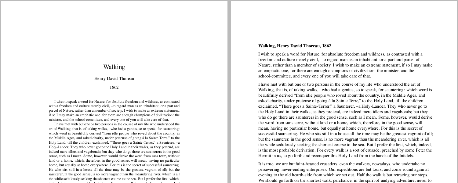
Here a quick before and after image:
A typical header I use to make LaTeX-documents look good is this:
\documentclass[10pt,a4paper]{article}
\usepackage{times}
\usepackage[english]{babel}
\usepackage[T1]{fontenc}
\usepackage[latin1]{inputenc}

\title{Walking}
\author{Henry David Thoreau}
\date{1862}

\begin{document}

\maketitle
[...]
See the tex [1], or pdf [2] for an example.
A common, also beautiful alternative, is to ignore the \usepackage{times}, so that the default computer modern (see Wikipedia: [3]) is used instead. For some reason I am not as font of this typeface -- perhaps because it is not rendered as nice on screens as I believe times is. Again, see tex [4] or pdf [5] for an example.
First we have to make the font bigger and make sure we use Times: \documentclass[12pt,a4paper]{article} and \usepackage{times} takes care of that.
Now we need to break the typography by screwing up the margins and introducing a ragged right: \usepackage{a4wide} and \raggedright fixes this.
Another default in word processors is to use a horizontal gap between paragraphs. I find this acceptable, even in beautiful documents, even though it might smell a little. \usepackage{parskip} does the trick.
We also need to screw up the title. The easiest way is to remove \maketitle and just use bold text instead.
To summarize, the diff is:
$ diff walking0-my-default.tex walking2-word-like.tex
1,2c1
< \documentclass[10pt,a4paper]{article}
< \usepackage{times}
---
> \documentclass[12pt,a4paper]{article}
10a10,14
> \usepackage{a4wide}
> \usepackage{times}
> \usepackage{parskip}
> \raggedright
>
13c17,19
< \maketitle
---
> % \maketitle
>
> \textbf{Walking, Henry David Thoreau, 1862}
The uglified version is available in tex [6] as well as in pdf [7].
If your boss is an apple fan-boy or a "designer" he/she might expect you to use helvetica instead. This is achieved by using the helvet package instead of the times package, like so: \usepackage[scaled]{helvet}. Here is an example of uglified LaTeX with Helvetica in tex [8] and pdf [9].
Enjoy!
The text in these examples is from Walking, a text by Thoreau: [10].
This page belongs in Kategori Mallar.
See also Latex Template.